NASA’s recently launched SPHEREx space telescope will map the entire celestial sky four times in two years, creating a 3D map of over 450 million galaxies. We can hope for new data on the composition of interstellar dust, among other things, so the mission has certain astrobiological implications. But today I’m focusing on the idea of maps of stars as created from our vantage here on Earth. How best to make maps of a 3D volume of stars? I’ve recently been in touch with Kevin Wall, who under the business name Astrocartics Lab has created the Astrocartics and Interstellar Surveyor maps he continues to refine. He explains the background of his interest in the subject in today’s essay while delving into the principles behind his work.
by Kevin Wall
The most imposing aspect of the universe we live in is that it is 3-dimensional. The star charts of the constellations that we are most familiar with show the 2-dimensional positions of stars fixed on the dome of the sky. We do not, however, live under a dome. In the actual cosmography of the universe some stars are farther and some are closer to us and nothing about their positions is flat in any way. Only the planets that reside in a mostly 2D plane around the Sun can be considered that way.
Now if your artistic inclinations make you want a nice map of the Solar System, you can find many for sale on Amazon with which you can decorate your wall. But if your space interests lie much farther than Pluto or Planet 9 (if it exists) and you want something that shows true cosmography then your choices are next to zero. This has been true since I became interested in making 3D maps of the stars in the mid-90s.
A map of the stars nearest the Sun is of particular interest to me because they are the easiest to observe and will be the first humanity visits. These maps are not really that hard to make and there are a few that you can find today. There is one I once saw on Etsy which is 3D but has a fairly plain design. There are some you can get from Winchell Chung on his 3D Star Maps site, but they are not visually 3D (a number beside the star is used for the Z distance). Also, there are many free star maps on the Internet, but none that really capture the imagination, the sort of thing one might want to display..
So why can’t star travel enthusiasts get a nice map of the nearest stars to Earth with which they can adorn their wall? With that question in mind, I started my interstellar mission to make a map that might be nice enough to make people more interested in star travel. Although I do not consider myself an artist. I thought a map done with more attention to detail and maybe a little artistry would be appreciated. My quest to map the sky has many antecedents, as the image of an ancient Chinese map below shows.
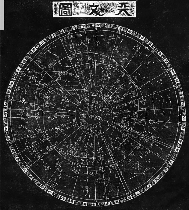
Image: An early star chart. This is the Suzhou Planisphere, created in the 12th Century and engraved in stone some decades later. It is an astronomical chart made as an educational tool for a Chinese prince. Its age is clear from the fact that the north celestial pole lies over 5° from Polaris’ position in the present night sky. Credit: History of Chinese Science and Culture Foundation / Ian Ridpath.
How to Make a 3D Star Chart
Before I go any farther, I need to explain that this article is about how to map objects in 3D space onto a flat 2D map surface. It is not about 3D models, which can be considered a sort of map but clearly involve different construction methods. It is also not quite about computer star map programs. I use the word “quite” because although a star map program is dynamic and seems different from a static wall map, the scene on your flat computer screen is still 2D. The projection your program is using is the same as ones for paper maps but you get to pick your view angle.
The first thing you need to do in making a 3D star map is get the 3D coordinates. This is not really hard but involves some trigonometry. I will not go into the details here because this article is about how to put 3D stars on the maps once you have the coordinates and data for them. I refer you to the 3D Star Maps site for trigonometry assistance.
The basic 3D star map is a 2D X-Y grid with Z coordinates printed next to the stars. The biggest thing going for it is efficient use of map area and, in fact, it is the only way to make a 3D star map with scores of stars on it. This map makes for a good reference; however, visualizing the depth of objects on it is hard. Although you can use graphics to give this type of map some 3D, you really need to use the projection systems invented for illustrations.
Much has been learned about how to show 3-dimensional images on a 2-dimensional surface and I cannot cover everything here. Therefore, I will summarize the methods I have seen used for most 3D star maps. They engage the visual cues that we use to see depth in real life to make all 3 dimensions easy for your map users to read. There are basically 2 ways of projection to visually show the 3D dimensions of something on a flat piece of paper: Parallel and Perspective.
The basic 3D star map uses a parallel projection. In parallel projection, all lines of sight from objects on the map to the viewer are parallel to each. So, unlike in human vision where things get smaller as they get farther away, everything in this sort of projection stays the same size into infinity. Because of this and the fact that such a star map has an X-Y plane that is parallel to the viewing plane, the Z coordinates are perpendicular to the viewing plane so that you can’t see a line connecting the X-Y plane to a star. However, if you tilt the XY plane so that it is no longer parallel, you can see the z dimension as it also is no longer perpendicular to the viewing plane.
Rotating the axes like this is called axonometric projection. It is used for most of the 3D star maps I have seen and is easy to create. It also gives a good illusion of depth. The scale of distances on the map changes depending on the angles an object makes with the map origin point. Although this is not a problem for viewers who only need estimates between objects, if you want to calculate the real distances you will need to do some arithmetic.
Perspective projection simulates the natural way humans see depth. That is, things that are farther from us look smaller. In perspective drawings, lines are drawn toward one or more points on the 2D surface. They determine the progressively smaller proportions of objects in the drawing that are farther from the viewer where the point(s) are considered to be at infinity. Star maps that use this will have distances that scale smaller the farther they are away from the reader. This makes for inconsistent distances, but it allows for maps to have extremely deep objects included on them.
My first map was large and had a simple design. It had a lot of stars (20 LY radius) and used an axonometric projection but it was not much different from the free maps that were available. Looking at it, I saw the problems a map reader would have in using it. These were things my latest map tries to correct, as I elaborate on later.
The main thing I didn’t like about it, however, was that it was not good art and not good star map art as well. It just wasn’t achieving my goal of being something a lot of people would consider putting on their wall. I have already admitted that being an artist is not one of my strong points. However, there are star maps out there that look good. So, I tried to see what the nicest ones had in common and tried to make something different as I moved on to my next star map iteration.
The Art in the Science
A map is like a scientific hypothesis. It attempts to model a physical aspect of the natural world and then it is tested through observation and measurement. This means that map designs have to be based on logical and testable methods. But unlike other sciences, cartography can use art to elaborate on those methods. Therefore, things like color and graphic design and the artistic beauty of the map are important factors.
The art in star maps can go beyond just the graphical enhancements that were intended. Looking at the night sky gives people a sense of wonder. Star maps, if done right, can capture that sense of wonder. Most maps have minimalist art designs that seem to do that best – circles and lines amidst white dots on a dark background. Fantasy star map art goes a bit farther in design and creativity but such maps are always recognized as having to do with that wonder. However, I think the more minimalist ones show the mystery better. Here is a minimalist fantasy star map without any 3D aspect to it that I made that has some of the aesthetics that I like.
Another map that has captured this quality of mystery is called ‘Star Chart for Northern Skies.’ Published by Rand McNally in 1915, it is a sky map of the northern hemisphere, one that interior designer Thomas O’Brien referenced in the magazine Elle Décor and later discussed in one of his books. It is a real map intended for reference and maybe to decorate classroom walls. It is one of the maps that have a simple style that nevertheless gives that sense of wonder. Although having a star map in an astronomy magazine is great, Elle Décor magazine reaches a much wider audience of people who would never have given this subject a single thought. This minimalist style of star map art is what I wanted for my own map.
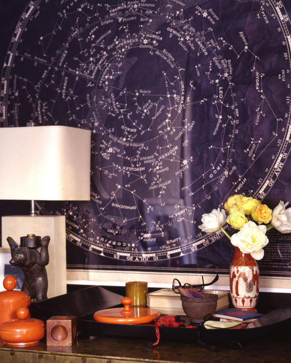
Image: The Rand McNally star chart as seen displayed in Thomas O’Brien’s home. Credit: Thomas O’Brien.
To make a minimalist art 3D star map demands a projection system that has some visual way to show depth without needing a lot of lines drawn on it. The axonometric and perspective projections seemed to me to require too much background graphics. So, I had to come up with something a bit different than what has been used before.
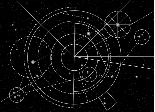
Eventually I thought of what was to be the 3D depth graphics of the map I call the Astrocartica (shown below). The graphics show visually the Z dimension of the star systems on it, but it is not as intuitively obvious as the other projections I have mentioned. You can use the map to find accurate distances between star systems with a ruler and without resorting to a calculator or even doing arithmetical estimating in your head.
I have found since making the Astrocartica that more than a few people have difficulty seeing how the graphics work to show the third dimension. Possibly this is because the system I use is unfamiliar to most people and my illustrations and efforts to explain it do not seem to be sufficient. So, I decided to make another star chart that was more user friendly.
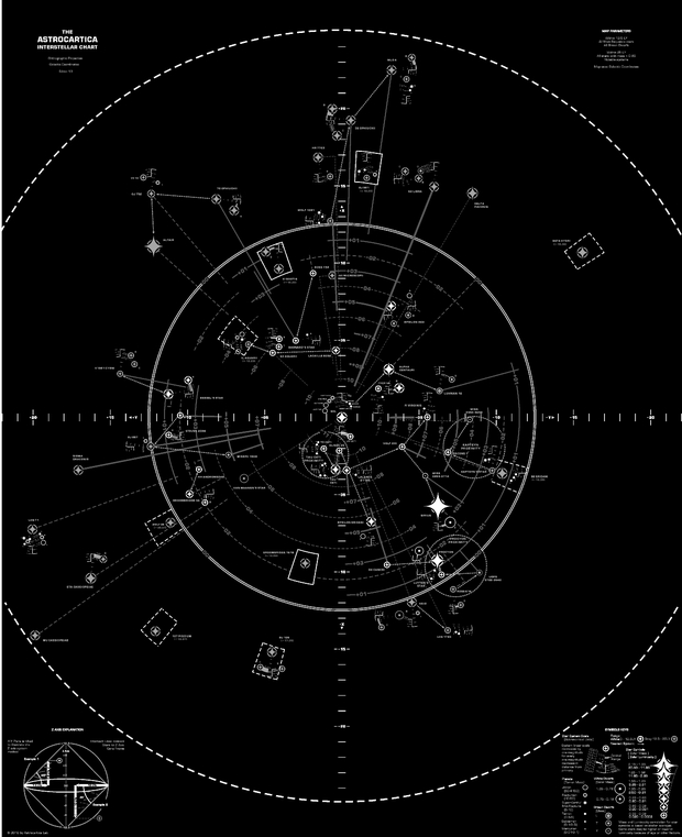
Image: The Astrocartica Interstellar Chart
The Science in the Art
A book called Envisioning Information by Edward Tufte (Graphics PR, 1990) has greatly influenced my star map designs. Tufte is an expert in his field of behavioral science and his book covers many aspects of data presentation such as layering and color. I had read the book while doing the Astrocartica star map and what I took away was just how art and science need to work together for good information display. I can’t say I succeeded completely in applying every principle in the book, but Tufte did make me aware of what a good design for readability needs to accomplish.
In the Astrocartica map, I emphasized the art. But, in my next chart I wanted to emphasize the readability of a star map because of my experience with my other maps. Since the depth projection was the chief issue with the Astrocartica, I considered the proven ways to illustrate 3 dimensions on a flat surface. The parallel and perspective projections were designed to work with the use of the visual cues that humans use and they have been used for centuries. So, I decided to use one of these. I felt perspective is more appropriate for pictures and painting and that, for a map, the scaling for objects in a perspective illustration makes it hard to measure accurate distances without doing arithmetic. I chose axonometric because scales were not as inconsistent as perspective. Also, parallel projection is often used for scenes in computer games and is familiar to people as a way to illustrate 3D on a flat computer screen.
My first map had a single plane. This put some stars that were far from the plane on the end of long extenders that made reading their X-Y position awkward. Also, having all the extenders on the one plane made it crowded and hard to differentiate them. So, I tried maps with several planes and settled on a design with three.
I also put several visual cues on the new map, called Interstellar Surveyor, to show the differences in the local space cosmography. First, the grid lines that are close to the stars are a lighter color that stands out compared to the lines that are farther that are darker. This shows areas of local space that are relatively empty. Also, the edges of the parts of the planes that have stars are thicker than the parts that do not.
One thing that I took from the Astrocartica was the star system graphics. It shows distances in star systems by increasing scale by a magnitude of 10x as you go away from the primary. I tilted the system plane to match the main ones for the sake of the art.
I think, overall, the Interstellar Surveyor map is more user-friendly than the Astrocartica or the first map I attempted.
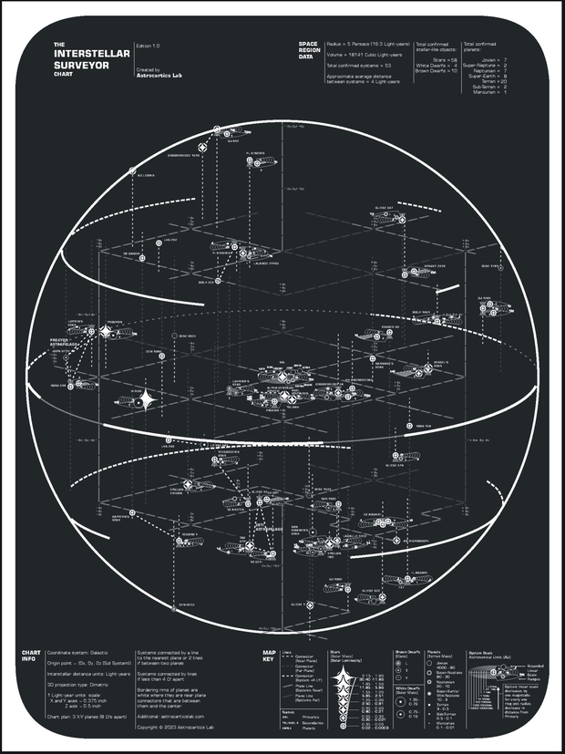
Image: The Interstellar Surveyor Chart.
Astrocartics
I think the cartography of outer space is a long neglected field of study. Cartography has a unique connection with the human understanding of the world around us. It seems to serve both our rationalizing and aesthetic senses at the same time. That alone makes it important to develop and expand. But, while cartography has been engaged in studying the Earth, it really hasn’t explored the rest of the universe like some other sciences have even though it can.
In every field of study that is based on science there are logical principles. General cartography principles divide map projections of the Earth into how they transform areas and distances. Maps of outer space also have differences and patterns that seem to be able to be put into a categorical system. Here is a possible system to categorize and (more importantly) understand maps of outer space. It attempts to put the different projection systems into categories and is based on how the X-Y plane of a map is rotated in 3-space.
Type I – Planes are parallel to the viewing plane – these would be flat maps with little 3D relief.
Type II – Planes are at an angle between parallel and perpendicular – these would use mostly axonometric projections for 3D relief.
Type III – Planes are perpendicular – for deep field maps and art.
There is one other thing – the name of the field. The term “stellar cartography” would be the first choice. But it is very deeply rooted in sci-fi and is too often pictured as the map room of a starship. That is not necessarily a bad thing but another problem is that there is more to mapping outer space than just stars – there are nebulas and planets with moons and perhaps other kinds of space terrains. Outer space mapping is more than just “stellar”. The word “astrocartography” is another logical choice. However, it has been used as a label for a branch of astrology for many decades now. Also, the word is trademarked. The word “astrography” is astro-photography.
The word “astrocartics” means charts of outer space. It comes from the word “astro” which means “star” but can also mean “outer space” and the word “carte” which is an archaic form of the word “chart” or “map”. So this is my proposal for a name. Also, I think it sounds cool.
Well, I think I have said all that I can about astrocartics. I am going to be making new maps. There will be an Astrocartica 2.0, a solar system map with unique graphics and a map that might be considered astro-political in essence. I will also be adding a blog to my store in a few months. I am willing to talk to anyone who wishes about space maps.
This is a nice explanation of the desire to use art to produce stellar maps using different techniques. Unlike landscapes where perspective and color can trick the observer into seeing a 3D image from a 2D one, stellar maps cannot easily offer such tricks.
In chemistry and biology, images that can be rotated provide a better appreciation of chemical molecules and biologically relevant macromolecules such as proteins.
One half-way approach to 3D is anaglyphs – using 2 images, one to each eye. The same effect can be done with red-cyan viewers and a composite picture. I recall when 3D tv was going to be the “next big thing” that eyeglasses with polarizing lenses were another approach to anaglyphs but for video. The 19th century produced many 2-photograph anaglyphs of scenes and events, and as a child I recall using a common toy to view such scenes.
The artist Don Davis has been generating red-cyan anaglyphs of scenes on other planets (Mars) and moons, most recently with Firefly’s Blue Ghost moon lander. Have you considered one of these approaches, or are the aesthetics too compromising?
A comment about the store on your blog. The images are far too low resolution to appreciate the detail needed. I suggest showing high-resolution details of each map so that the visitor and possible buyer can see the quality of your maps.
While I still hang static prints and photos on my walls at home, I am aware that OLED screens that can display images and videos are gaining in popularity. This suggests that 3D star maps that rotate to provide the illusion of depth might be worth thinking about. Both the rotatable map and the static art maps could be displayed, either in a sequence or interactively.
I have looked at other ways to create 3D effects on 2D surfaces. Computer generated images are one. Many years ago I even made one for myself in VB. I was never interested in anaglyphs enough to learn how to make them. My aesthetic tastes are more for minimalist art. But I might look into other things again. Maybe I am getting old, but putting a giant monitor on your wall just to display art seems such a waste.
Thank you for the suggestion about the store. I will put some better images up as soon as I can.
>I have looked at other ways to create 3D effects on 2D surfaces.
This is one of the oldest things :) see the paintings of Lascaux or men of that time used the relief of the cave to paint their animals (what a sense of observation! ) Later, the Egyptians represented the volume (the 3D) by splitting their subjects that remained in the same plane; after the Renaissance, the volume was suggested by colored differences etc. Today, the computer (of 0 and 1) is only a new technique to create the same artifice. Nothing has changed in ~21,000 years. Funny, right?
As if the dimensions were unique to itself. They can be transposed (3D to 2D) but then systematically lose some of their authenticity. In other words, it seems that a multidimensional universe cannot perfectly transpose into another universe which would have one or more dimensions more or less than the first. Is it the same with mathematics ? Mystery…
Remember that we see the world in 3D thanks to the stereoscopic vision of our eyes and our brain, but that our world would be …in 2D.
We are in our universe like the goldfish in the aquarium stuck in its 4 dimension. but who tells us that the aquarium is not itself in a universe of 5, 6 or 10 dimensions ?
Thanks for your article and your work, Tufte is an amazing thinker and designer.
One of my favorite objects at the Smithsonian National Air & Space museum on the Mall was a physical star map using tiny lights, colored to the star’s brightness and temperature, hung from near invisible wires to scale with SOL at the center. It was about 3 – 4′ in diameter by 4 – 5′ in height and set in a darkened mysterious room.
Also, in the 1970’s, I had an early map of galaxy locations showing the now familiar threaded, spongy texture of distant space created by James Peebles’ lab. It didn’t attempt any 3D effects but was quite awe inspiring. I just wrote Dr. Peebles and got a near immediate replay as follows:
“Yes, Scott, I certainly recall the poster. The raw data were taken by hand in the 1950s by Donald Shane at the Lick Observatory in California. Students and I at Princeton transferred the data sheets to punch cards and made the image. The poster was made in California by Stewart Brand, creator of the Whole Earth Catalog. A lesson: almost all of us are involved as essential parts of cooperative chains. And worth noting that I was an immigrant alien.
Cheers, Jim”
Amazing, right?!!!
‘Cooperative chains’ indeed! Great story, Scott. Thanks.
I wrote him back as follows:
SIr,
I am astonished to hear from you! Thank you and of course, the Whole Earth Catalogue was certainly where I got it.
Re “immigrant aliens” where would we deport them should they arrive? Of course they would have “Green Cards”, Oopsie!
I won’t go on, delightedly yours,
Scott
Well done, Scott.
Yeah, that Smithsonian model was made by a company called Stellarium. They use to have a website but they have been gone for a long time now. They had made several of these models.
Yes, that rings a bell, Kevin. Many such exhibits belong in the Museum of Old Exhibits (MoOEX). Also there will be the American Museum of Natural History’s New York Exhibits!
Beautiful maps, indeed. Let us not forget these 3-D star maps and all the information behind them…
https://atomicrockets.net/public_html/starmaps/
https://projectrho.com/public_html/rocket/spacemaps.php
Yes, Winchell Chung’s 3-D Star Maps site has always been my primary inspiration.
Very nice article. I’m surprised by Rand McNally’s first drawing of 1915, which immediately evokes some of V. kandinsky’s paintings; the similarity is surprising:
https://art-virtuoso.com/blogs/artistes-celebres/wassily-kandinsky
Man has always tried to retranscribe the 3D world in 2D, from the moment he started looking at the stars for his calendars, but history has shown that the experiment has never been perfect, despite all the models invented: either we lost precision, or we systematically created distortions from the moment we “flattened” the 3D. Perspective solved part of the problem, but was limited to a certain field of vision, which is quite incompatible with the idea of representing a global volume unless you want to become illegible towards the vanishing point. In a way, perspective is the opposite of the cone of vision of our telescopes.
Note also another ingenious trick found by “cubist” painters, who looked at an object or face from different angles (notably that of a cube, hence the name “cubist”) and then synthesized each point of view by combining them into a single 2D plane. Who said it was kid’s “daubing” ? :)
In short, you can’t put the universe in a box, and we’ve always had to make do with a compromise between stone and paper, even if today’s computer modeling allows for good 3D visualization, without the poetry. Which brings us back to one of mankind’s oldest problems: how and why should we transcribe our universe? Is it a way of making it our own? Probably…
To visualize what traditional cartographic projections represent, use this site to create your own maps… alas, terrestrial ones:
https://www.worldmapgenerator.com/en/
On a more scientific level, the role of a map is to provide information, so it needs to be as accurate as possible.
The subject becomes interesting because it invites us to think about the notions of registration for inter-galactic travel. We’ll need to rethink our entire spatial cartography, because once we’ve left our galaxy, earth-moon-sun will obviously no longer be possible reference points. We’ll have to choose a few cepheids; pulsars or red giants as calculation points; define a standardized orientation for the astrocarte (where will the compass north be?) and the GPS won’t have to be disturbed by all the space radiation: everything has to be invented, especially if we send the “astromap” to E.T. so that he can come for coffee and not get lost on the way :)
along the same lines, I had started work on creating 3D models of our constellations, respecting the distances from Earth, and then viewing them from outside our galaxy. Obviously, the famous drawings of our constellations become unrecognizable. The choice of observer is therefore crucial. The old “Starmap” computer programs no longer work under Linux, and unfortunately I don’t know how to program (amateurs beware). So I went back to using matches and Styrofoam balls to make my constellations… they’re simmering.
One of the difficulties I’ve noticed with representing space in 3D is scaling: the distances are so great that you either have to cheat, or use logarithmic systems. Perhaps that’s what’s most different about terrestrial cartography?
Would the same thing be true if we went from 3D to 4D and beyond? (I’m excluding maths, which seems to be the only science that can transcribe things).
Scientific rigor, legibility and, if possible, aesthetics: cartography is a fascinating world.
@Fr ed – You bring some unexpected and interesting perspectives (pun unintentional) to this subject. I loved your comment.
To add to the distortion, we are used to a terrestrial POV, in that everything is static in space. The distant mountains will not move when you reach them. Within the solar system, planets move in their orbits, so the best we can do is take snapshots of positions, knowing that they will move as we try to reach them. Even so, not much will change on the planet or moon when we reach it.
Distant stars and galaxies are so distant that when we depict them on a map, we do not represent that what we are seeing is the object deep in its past. With galaxies, their movement is indicated by redshifts, but in reality, what they look like if we could reach them instantaneously would be very different. Because we can only travel at (as photons) or below c the object will change even further as we travel. We only produce such maps of the universe as we see them today, but not as they really are if the light from them could reach us instantaneously. Can we map the universe as it might be today (if that makes any sense) rather than what we see when its light reaches us?
@Alex
Coming from you, I can only thank you for the compliment. What you mention is exciting, I will answer a little later…
“Instantaneous representation” is of interest. It implies a “gods eye view” of everything. Would that require and extradimensional POV?
Or, perhaps like in Contact, there are interstellar “subways” whose stations remain connected to their endpoints as they move?
Good thread, Fred (Alex and LJK)
Too little is said about maps and the contribution they have made to worldviews, beliefs and ways of thinking. Today, it seems to me, they’ve been relegated to being mere secondary tools and mathematical coordinates in machines.
Maps are strange objects: they can tell us many things without any numbers or writing! They are a sum of information, but also the testimony of the civilizations that created them; they show how we see our World. Take a look at a portolan.
>Remote stars and galaxies are so far away that when we represent them on a map, we don’t represent that what we see is the deep object of its past.
This is also true on earth, but the speed of light gives us the impression of a snapshot. You look at a pretty girl in the street and she’s already not what she was the moment before (it’s frustrating ;) It’s the old problem of the reality of the world…
I agree: the landmarks we can choose from will in fact have long since disappeared, so we’ll have to invent astrocards with other reference systems. How can we locate ourselves in space and time when these two factors fluctuate, for example at relativistic speeds?
>Because we can only travel at (as photons) or below c, the object will change even more as we travel.
which could mean that for relativistic travel, our astro-maps could only serve us… once! if we want to make an extremely ancient return trip (super-clusters?) to rebuild a system of coordinates. On these gigantic scales, we could even imagine that the multiverse, if it exists, would be our reference points, since everything in our universe is changing so fast…
>Can we map the universe as it might be today (if that makes sense) rather than as we see it when its light reaches us?
which would mean “bringing the redshift back to zero” at the present moment, in a way “flattening” the universe to freeze it in the present moment. There would then be no more depth, no more dynamics, so ultimately no more mystery and no more research, since we could measure everything…what would we do next ? ;)
Astro maps that are needed for navigation at high fractional c velocities, and even superluminal if ever possible, cannot be static, but must be dynamic.
Even terrestrial maps for the seas need tide tables as depths change, so the static map needs support for this dynamic.
Today we have Gaia data for the movement of stars. Therefore a “god’s view” of the galaxy could be made by projecting the movement of a star forward in time depending on its distance from us. But even that will not work perfectly as chaos will intervene. We could even model the evolution of stars, showing how they would change over time so that our data on their past can be extrapolated forward. This would still be possible for a 2D chart with a fixed POV from our system.
Interestingly, Asimov wrote a short story where a criminal was stuck in space because a new nova/supernova appeared, confusing the ship’s navigational computer. In our reality, that could happen as we travel in space. Out star charts would be like a movie, where we and nearby objects are at the end of the movie, while distant stars are near the beginning. We would like to wind that movie forward for those distant stars to see their status and position in our “now”. [If we had that movie, we could fast forward through time to see if other civilizations appeared and disappeared, perhaps becoming starfaring.
All this suggests start charts cannot be static if they are to be used for navigation. They must not only be 3D, but also have a time dimension that can handle positional and evolutional changes in time. This may not be possible. However, if the universe is n-dimensional (10 or 11 according to some models, with the other dimensions rolled up, is it possible that we could see distance objects as they are in our space-time position by using these other dimensions?)
In the delightful book “The Stars” by H A Rey, on p149, the Big Dipper is illustrated showing its shape changes from 100,000 years ago to 100,000 years from now. What did it look like at the dawn of the Homo line when H. Erectus looked up at it 2 million years ago, or even earlier when Clarke’s Moonwatcher gazed at the night sky? If [post-human 1.0, post-biological] humanity survives another 2 million years, what would it look like then?
The Rey book is a wonderful memory from my childhood. Still have it around here somewhere.
There is a book called “Vistas of Many Worlds” that has an image of the sky 1.5M years ago with a H. Erectus sitting under it.
It is a beautiful 9″x12″ book by Erik Anderson. Every other page of the book is an image of the sky of Earth or another world with text and a small map on the opposite page. The design reminds me of the old Terran Trade Authority books if anyone remembers.
Erik Anderson had a map that Paul showed on this site years ago. He latter published his book himself presumably out of his own pocket. It looks like it would have been expensive. But then, he passed away a couple years later (2015, I think).
I hadn’t realized that Erik had died. That book was wonderful.
I just bought that book. It is gorgeous. It is copyright 2012, and pretty up-to-date with a painting of the Webb telescope.
The Ashland Atronomy Studio URL, http://www.astrostudio.org, looks like it has been acquired to sell items associated with ESP and related ideas.
Good work Kevin